Because the theme i have chosen to pursue is 'I Wish You Were Here' i have taken the time to find some very old postcards that featured old fashion handwriting, amongst the whole aesthetic mix of nostalgia. It seems that the vintage item, whether it be clothing, books or novelty goods, seem to be the 'in' thing at the moment and would therefore better my card range by rooting it as contemporary.
Here are my finds:
I find that the top half of this card is far more expressive that the writing itself; It's so dark and intense, especially with the red stamp.
This was bought purely for the writing alone. In fact, this is the best outcome i could have hoped for on the rear of an old postcard; the writing is old fashioned; it's not conventionally set out on the space given; and it's all written in French so no one can get too distracted with what it says.
My aim for these cards are simply that the opacity is dropped on them as i did in the experiment before in the post titled 'Background Development' so that they are still visible, but not dominating, and that they serve either a backdrop or a fill... Most likely a backdrop.
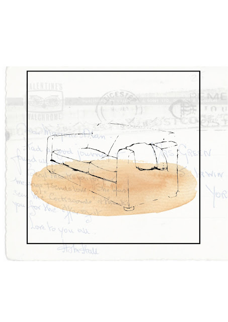
This works well and is pleasing to the eye because of the symmetry of the stamp box and the address guide lines. I also quite like how the central parting runs up through the sofa; its like i have just printed my design onto an old postcard - exactly.
As nice as the dark intensity was when the opacity was original at 100%, it's lost its appeal now and although still effective, it just doesn't work for me here i don't think. I also do not like that the dominating word that you are immediately drawn too is 'LEICESTER'. This may be a problem when i come to add my text at about that height over the top.
I really enjoy how this piece sits as an image, but it seems very swamped by old fashioned french handwriting. However, the positioning of the postcard i think is spot on using the magpie in the stamp box as a guide and a novelty piece. I may use this on one of the inside pages, it doesn't seem effective on the front page, it's too dominating.
I have decided to show the background used with a different image. However the background again comes across as too busy. I like the infiltration of the red stamp, but again the text of 'LEICESTER' showing and this time 'REMEMBER'. This doesn't work for me.


No comments:
Post a Comment