Monday 28 January 2013

Evaluation


This project has worked out well for me in terms of time management and work ethic. I think that this is partly due to the potential that it may get used in the future in a card range through UK Greetings. It has renewed confidence in my work, especially down an avenue I haven’t reached into before.
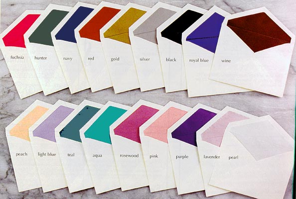
Having never worked in this area of illustration I came with a fresh head, which I think is important, so that I don’t end up relying on what I have previously produced. Although I didn’t come knowing my strengths in this particular field, I think that I have identified many as a result. For example, I enjoy focusing on the handmade side of the work: The Hand Stamper, the painted swirling bases, and the main cover images, and the envelopes.
I am pleased with my final outcomes and feel that I have worked closely with my work and enabled myself to produce it well and in a professional manor.

I have found it much more efficient to keep account of my work with a blog, it just seems so much more helpful when you know that your outcome has to be digital, it really ties it all together well.

My Weakness in this project would be not locking down a specific theme to work too at the beginning, whereas I, for example, ended up working off topic for a short while at the start, producing ideas for an extended avenue of work, whereas if I hadn’t have done that it may well have freed up some time at the end to show some further extensions to my work.

In terms of the greetings card’s job, I would say that they are effective and efficient in their purpose as they clearly present the topic and deliver it effectively. Creatively I think that they stand out and at the same time blend in with the current market; what will set them apart is their theme, which is communicating to an audience a widely unknown ‘card’ theme.

With this work I plan to send it off to UK Greetings both through the competition and straight to them as a possible branded range. But even if UK Greetings don’t pick up my work and produce it I will definitely pursue it myself through hand-making my outcomes and selling them at fairs and other such events. So shops like No Guts No Glory might well be interested for example, or other such hand-made themed organisations.
Post project I have already produced a card and envelope of the same style but as a reply to a wedding invite. This is very exciting because I am actually using my own product and testing it out for real. (See pictures in previous post).

To take this project further I would extend the topic and look at other areas of why you’d Wish Somebody was here. For example, I could focus on famous pairs that people would recognise, The Two Ronnies for instance with their famous glasses, or John Lennon and Yoko Ono. The title of ‘Wish You Were Here’ would stay the same, but would move away from the home.

Mock-Up Of Final Outcome


Here is a sample of my mock'ed up outcome of the Sofa produced on what peers thought would be the most effective colour (Ivory) and quality paper to suit my designs. I haven't included the other 3 cards in the range as it would be repetitive when you can get all the information out of this set of images. So, below are photographs of both the card in all of it's glory along with the complementing envelope to complete the visual.


Extremely pleased with the outcome, it now serves as a template for other occasional themes. Below are photographs of the card format but being used and adapted for a wedding RSVP. This is real and something that i have sent off in the post. The ring image has been created in the same way as the sofa and other imagery used with the bleeding pen with water. I think that this works really well, and although in it's early stage of being refined in terms of quality, i think it serves its purpose well.


Sunday 27 January 2013

Further Industry Research


It has been made clear that to improve i should focus on the greetings card industry and find out how to go about researching other companies that take submissions for artwork.
I think that these 3 websites below are the strongest examples i have found in relation to this topic:

The first talks about purely online submissions and gives examples of how to go about submitting work:

http://www.anomadslot.com/5-greeting-card-companies-that-accept-online-submissions/

The second is a 'How To' site that sorts out the nitty gritty once the artwork is ready to send off, looking at topics such as 'How to organise your greetings submission' etc, along with various comapnies that accept commissions both in art and writing:

http://kateharperblog.blogspot.co.uk/2009/05/10-card-publishers-artist-and-writer.html

And the third shows a list of publishers for the Greeting Card Association along with how to submit work:

http://www.greetingcard.org/AbouttheIndustry/GCAMembersAcceptingSubmissions/tabid/162/Default.aspx


From the knowledge gained by this post i feel comfortable enough to market my work to various companies and how to go about it. This, of course, will help me greatly in the future after graduating.

Friday 18 January 2013

My Envelope


Having researched and drafted what qualities i am after in an envelope and what would best suit my work, i have had a couple of outcomes. The first is my initial thoughts and mock up ideas:

The inside of the envelope is lined with my logo, something that adds an extra desirable quality.

The front of the envelope also holds my logo, but in the style of an old postal stamp. This intentionally sits below the address.

Naturally this needed developing. For example, the folding flap barely met, there were gaps in both bottom corners from the rear view, and the lines all seemed a bit too straight.
So with that in mind, here are my developed outcomes as a result:

I have flared out the rear of the envelope, rounded the corners on the side folds, and lengthened both the folding flap and the rear of the envelope.
With this development i have also taken away the fold lines on the front of the envelope so that i don't have to worry about lining up perfectly, it just counts on where the chimney stamp goes.

Again, this needed developing, but this time i really think that the flap needed to have rounded corners to sit flush with the rest of the design. So here it is. (The front design has stayed the same.):


Monday 14 January 2013

Development After Presentation


Following my very enjoyable presentation (i genuinely enjoyed myself) where everybody gathered round the computer screen to take a closer look at my work and give even more positive feedback, i have been given a few pointers to take away with me. These are as follows:


  • Firstly, put the final images on the templates that i have created the correct way around. (Very embarrassing, but glad that the tutor pointed it out). The rear of the card was placed on the right hand side, and the front was on the left...
  • Secondly, it was suggested that i try using different paper qualities and experiment with weight and texture. For example, just choose 4 different qualities of paper and print your design onto them. With this suggestion, i am planning to print each design once onto different paper, so i will end up with four outcomes on different types of paper.
  • Following this it was also said that i should loose the inside cover image of the postcard. I needed to be told this because i wouldn't have seen how much it doesn't tie in with the style and line qualities of the rest of the work on the card. So with this and the previous point in mind, i will now be able to hand print each inside message. This will be particularly useful in my experiments with paper quality.
Overall i was extremely pleased with my presentation and how i portrayed not only my practice, but also myself

Tuesday 8 January 2013

The Envelope


Now that i have my card size finalised, i can think about the envelope construction. It's important that i have a strong looking envelope to really polish off my card.

Here are some possible ideas that are already out there:


This is your basic greetings card envelope: White with the triangular flap. I will use this as my starting point to see if i can make this more interesting and relating towards my card range.
Introducing the air-mail theme is nice because there is so much more going on on the envelope than if it were just a regular one, however, this does and at the same time does not relate to my card. There is always the potential that it may end up over seas, and i suppose it does fit nicely with the postcard theme, however, it is just a greetings card.


I have chosen to focus on this envelop because of the stamp involved. I like it's aged effect and authenticity that it gives off. Perhaps something i can include onto my envelope to stop it being so plane at the moment... Instead of this rounded stamp, i could always use the Chimney 'logo' that i have used on the rear of my cards.


Coloured envelopes! This will definitely stop any planeness, and i could potentially relate it to my warm card range with an off white or bright colour. Perhaps a pattern?...


Patterned envelopes! Definitely a way of making my card stand out, However, i think now that with the time i have left i doesn't seem worth doing what would only be a half hearted, rushed job. Perhaps i will consider this route if i ever come to hand make my cards myself.


I have come across this lined envelope that appears to not be just the basic triangle fold as well. I really like the idea of the envelope being lined, It's not as striking as the patterned ones and therefore subtle in it's job giving a quirky added interest and quality. I realise that this has a pattern inside, which is nice, but again, i unfortunately don't have the time to produce an outcome of this quality. I do however like the colour of this envelope...
As for the rectangle fold, i this that this is also worth pursuing because, again, it adds interest.


Here are some more basic coloured lined envelopes that look very professional even though basic. This is relieving because although here intended for wedding invitations, there is nothing to say that the idea can't be used to suit my cards. http://www.discount-invitations.com/indivpgs/lined.htm
These envelopes suit the standard white look which really makes that inside colour stand out. This is interesting because by doing it this way and not the way above with an unusual coloured envelope, i don't have to find a complementary colour to suit, so i can have what ever i thought worked well. I know that above i have said that i think an off white would really secure the warmth intended by the cards, but a white would give a nice contrast here with a colour lining the inside.

Having gone away and re-thought the envelope situation, i think that i will line the inside of the white envelope with a faint pattern of my Chimney logo as well as have it 'stamped' on the outside. On the outside i intend my 'stamped' chimney to be black as if printed with stamping ink and therefore resembling an authentic mail stamp. On the lining inside i hope to fade the chimney as not to be so intense. 

Saturday 5 January 2013

The Size


It is stated on the brief that i am to produce a card range in one of the suggested sizes:

159mm x 159mm
121mm x 184mm
137mm x 159mm
110mm x 210mm 

Now that i have my imagery and text all set out, i need to find the right size. You may have noticed that all along i have been working to the size of 159x159mm, this is because it's a square and the simplest to work on.

Here are what my designs would look like on the other sizes;

121x184mm:
The cover works well with this image layout. I have extended the text further from the image towards the top of the page to fill the space, but i still feel that this layout works.

This middle spread doesn't look very attractive; the fourth line appears rather untidy on the inside cover page definitely due to the height.


137x159mm:
This cover works well. It is very similar t the 159x159mm example, but comes across more quaint due to the lack of width which is very nice in some ways, but also restricting in terms of art work.
I think that in this open spread, the inside cover appears more easy on the eyes because it only shows three lines at the bottom instead of the four. Therefore these don't com across as garishly on this example in contrast to the 121x184 example as the longer card shows all four lines. However, it does come across a little messy when compared to the 159x159 example because of the writing used for the division between the correspondence and the address. Above it sits right on the boarder of the card, whereas on the 159mm it sits well into the page suggesting a full postcard theme.


110x210mm:
This card size would only suit a portrait stance due to the chimney and the burner that i have. They simply wouldn't work as images in this format.


Again, this spread doesn't work with the inside cover image. It appears too messy, especially with the double line at the bottom. It doesn't work.
The rear, however, looks very professional, something that i have found with every example so far. 

159x159mm:

The cover fills the space completely which is what i am after.
The same goes for the inside spread filling the space. The inside cover image sits well and works.
The rear of the card again looks professional which is of course very helpful.

Over all, i think think that it's wise for me to go with the 159x159mm card sizing simply because everything fits and comes across professional. 

The Rear Of The Card


Part of the competition brief from UK Greetings is that i have to think about a range name and logo to be printed on the back page. So it'll need to look something along the lines of:


Range Name
Logo
My Name + Copyright


Examples of this:


This is a very standard looking, sensible card with it's message clearly given along with the publisher and its website. SImple, but perhaps not what i'm after as this doesn't really shout excitement, and i feel that it would  have to reflect the card range in some way.

This is a more to what im looking for; the colours relate along with the text and details. I will thrive on this research.


This is a very simple et recognizable design. They can get away with something this basic because of their market/ audience/ customer base. Something that perhaps one day will happen to me? Anyhow, i cannot draw too much from this at the moment, but an example it is none the less of branding.


This is nice and simple; brand with logo, and the brand website. All i would need to add is the range name.


Again, another fine example of the simplicity of a card range name, logo and details.

I am thinking that i will use one of my front page images as that would refer to the range and in the time that i have left, it seems most sensible. I dont think i will use the Coffee Table or the Wood Burner simply because i think that the Sofa and the Chimney stack are stronger images. I will create thumbnails in my book of potential outcomes:

Prior to using the stamper.


Now with the stamper in use, here are some more detailed thumbnails:


I am unsure of which one to chose in terms of layout. I think i am set on the Chimney as the logo image though.
In my opinion, i fear that if i were to place 'I Wish You Were Here...' above the Chimney stack it would become too tall and uneasy to look upon, however, placed underneath, i think it would be a bit too much text in one big chunk to take in.
I should produce the outcomes in Adobe Photoshop and Illustrator to get a better idea:

 Text Below...
Text Above and Below...

I think i prefer the latter after all, and with peer feedback this confirms my decision. It appears more symmetrical and pleasing to look at. 


Friday 4 January 2013

The Inside Cover


Again, i originally would have left this blank but with the desire to use one of the low opacity postcard images. I could only place it here on the inside cover without it dominating and losing my text. I really wanted to use the french one as this for me was most exciting and aesthetically pleasing.
Here are my outcomes: (The Opacity has stayed at 25%)


The Inside Text


Originally i wasn't bothered about coming up with an inside message as the cover text spoke for itself, i couldn't exactly write that again inside. But i have come up with an individual text for each card that relates to the cover image and runs off the cover text. For example, given the front page message 'I Wish You Were Here...', the inside message will relate to that by continuing the '...' where the text left off from on the cover, and enter onto the message.
I've mentioned that each inside message is different given the image on the front, and this is because each one can mean something different, and potentially personal to the buyer, therefore potentially selling greater with this new appeal.
Given which card you choose to send, the inside message will read:

'I Wish You Were Here...' '... Curled Up On The Sofa'
'I Wish You Were Here...' '... Drinking Tea'
'I Wish You Were Here...' '... Next To The Fire'
'I Wish You Were Here...' '... Up On The Roof'

I think that this makes sense to do it this way as it adds another dimension to the card range, especially as i thought i wasn't going to bother with the inside reference.
I could add 'With Me' to the end of each sentence here, but if you think about it, you're ending the card with your name, and to me that's good enough as a 'With Me' statement.

Here are how each one would look, hand stamped again for continuity and originality:


Front Page Final Outcomes


My first and most likely final outcome is the unpredictable print style with complementing imagery and text and the water colour swell base to bring it out from the page and to add a warmth of colour and continuity.

My second but potential final outcome is the silhouette outlined in white. I think that this looks really classy and serious, but personally i would go with the one above if i were to buy either in Paperchase.